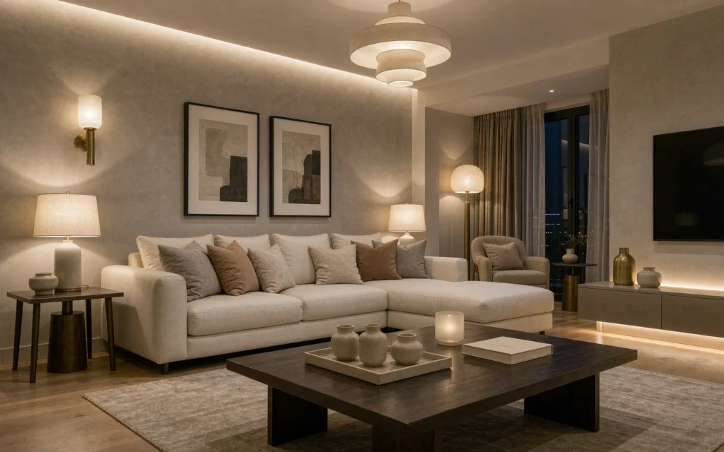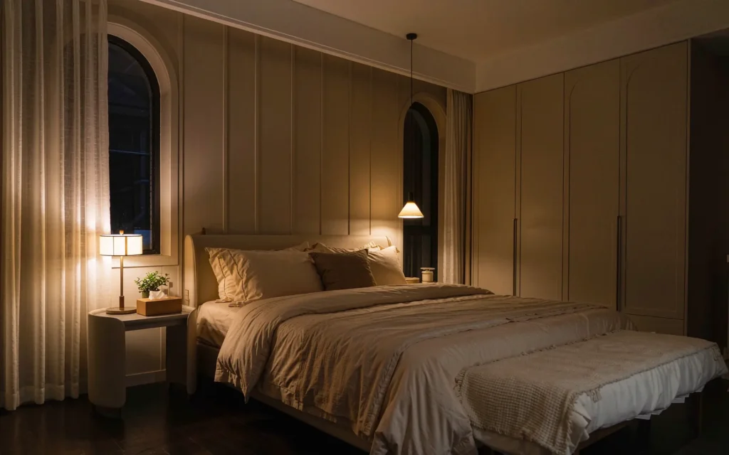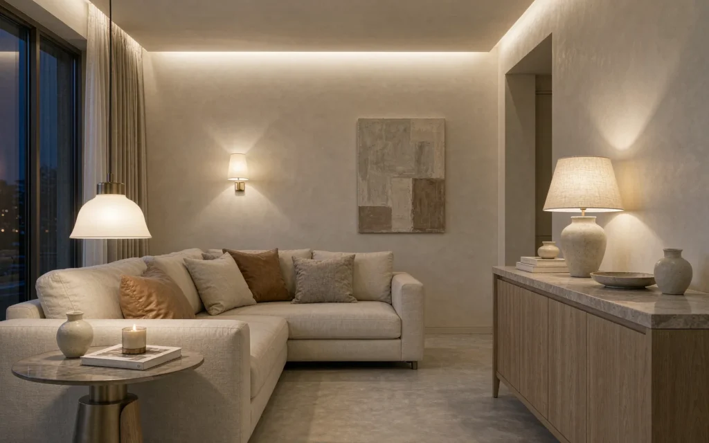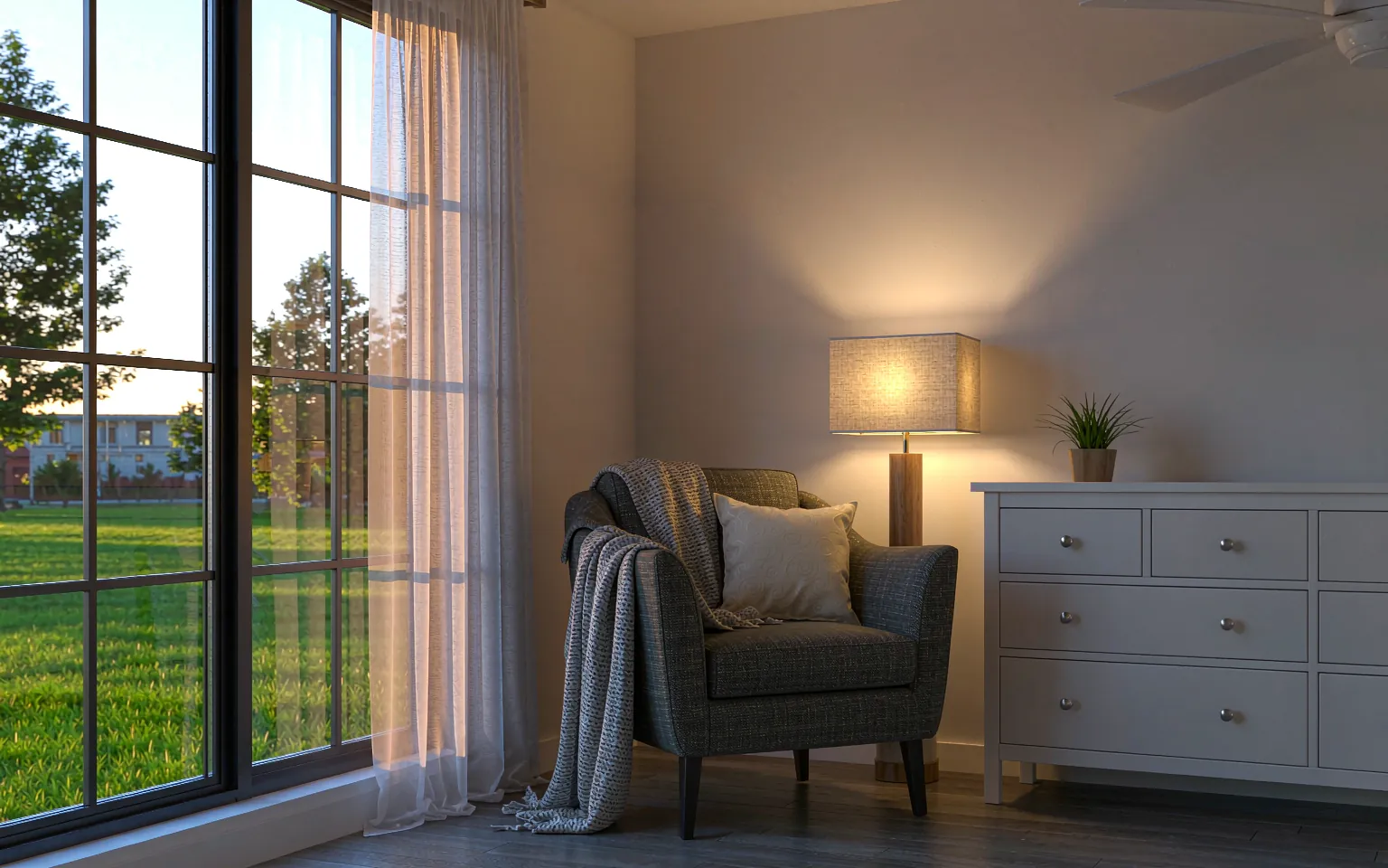
Two rooms can have identical fixtures and identical brightness, and one feels like a warm hug while the other feels like a dentist’s waiting room. The difference is color temperature — measured in kelvin (K) — and it is the single setting people most often get wrong. Here is the whole subject, minus the jargon.
What the numbers actually mean
Color temperature describes whether light reads warm (amber) or cool (blue). Counterintuitively, lower kelvin numbers are warmer light:
| Kelvin | Reads as | Feels like |
|---|---|---|
| 1800K–2200K | Candlelight, very warm amber | Flame, sunset, restaurant booths |
| 2700K | Warm white | Cozy home — the default for living spaces |
| 3000K | Soft white warm | Slightly crisper, still clearly warm |
| 3500K–4000K | Neutral white | Office, retail, kitchen work surfaces |
| 5000K+ | Daylight, cool blue-white | Hospital, garage, workshop |
The practical range for homes is 2200K–4000K. Everything above 4000K belongs to utility spaces, not living ones.
The room-by-room cheat sheet
| Room | Recommended | Why |
|---|---|---|
| Living room | 2700K | Relaxation is the job; warm light signals evening |
| Dining room | 2700K | Food and faces flatter in warm tones — see our dining lighting guide |
| Bedroom | 2700K | Warm light supports wind-down — bedroom ideas here |
| Kitchen | 2700K–3000K | Warm overall; a cooler task light under cabinets is fine |
| Bathroom | 3000K | Slightly crisper for grooming while staying homey |
| Home office | 3000K–4000K | Alertness for work hours, still livable |
| Hallways | 2700K | Transitional warmth that connects rooms |
The one rule that beats everything: consistency
A room with one 2700K lamp and one 4000K bulb looks broken in a way that is hard to name — the eye registers the clash even when it can’t identify it. Within any single sightline, keep every source within about 500K of each other. Open-plan spaces count as one sightline: the whole area should share one temperature.
If you remember nothing else: warm for anywhere you relax, cooler only where you work, and never mix temperatures within view.
Dimming changes the mood, not the number
A common confusion: dimming makes light feel warmer, but the kelvin rating stays the same. A dimmed 2700K bulb at 30% still emits 2700K — it just reads softer. That is exactly why the dimmer-and-warm-bulb combination works so well: you get genuine evening atmosphere without weird color shifts. (Some specialty bulbs dim “to warm,” shifting toward 2200K as they dim — a nice effect for bedrooms and dining rooms if you find them.)
Three traps to avoid
- Daylight bulbs in living spaces. “Daylight” (5000K+) sounds natural but reads clinical indoors. Real daylight is moving and diffuse; a 5000K bulb is a flat blue-white slab.
- Buying bulbs without checking the label. The kelvin number is printed on every bulb box as “warm white / soft white / daylight.” Ten seconds of reading prevents the most common lighting regret.
- Mixing temperatures in open shelving and glass fixtures. Exposed and semi-exposed fixtures broadcast their color temperature — they are the worst place for a mismatched bulb.
Frequently asked questions
Is warm light bad for reading?
No — readability depends on brightness and direction, not color temperature. A focused 2700K reading light at adequate output is easier on the eyes than a cool diffuse one.
Can I mix 2700K and 3000K in the same room?
Usually yes — they are close enough that most eyes blend them. The clash starts around 3500K+ against warm sources.
What about smart bulbs that change temperature?
Useful in bedrooms and home offices, where a cool morning setting and a warm evening setting genuinely help your body clock. Just avoid the auto-schedule in rooms where you watch the light shift — it can be distracting.
Which of your fixtures suit warm bulbs best?
All of them are designed around warm white sources — opal glass and soft diffusers in our ceiling lights and pendant lights deepen the warm effect, while open-globe styles show it off. If you want a fixture tailored to a specific color plan, custom lighting starts from your room’s palette.